The design elements shown on the website portray the personality of Perez Hilton very well. He does this by using bright colors, sparkling things, pictures of himself, and many different things. I also find it to be a very user-friendly web site. Being that it only shows one page at a time of celebrity gossip and then if the reader wants to read more, then they just go to the next page. The design has another aspect, advertising, which I find to be very annoying. Perez Hilton makes things like movies he advertising. The movie will be in all of his advertisements, and he will also write about the movies. He makes it seem like he really wants to go see them, but the reader never really knows if he really wants to see it, or if he is just playing up his advertisers for more money. He does this a lot for the movies that are coming out, or the new T.V. shows.
Format & Organization of the Perez Hilton Web Site
As previously mentioned website is formatted the to be user-friendly. The site is only a page of celebrity gossip with pictures, videos, etc, and blogs about those things. There are also entries on the page that are just blogs and do not have pictures or videos. This type of organization makes sense because of the audience that Perez Hilton is writing to. The users are only looking for celebrity gossip and what he thinks about the things that are happening. They do not want to have to click on a million things to get there they just want it right in front of them. This is a very easy way for Perez Hilton to appeal to his users.
The percentage of text to visuals on his page is a big difference. The amount of visuals is way higher than the amount of text. There will be a huge picture of something to a small paragraph of text. He stresses on having the celebrities talk for themselves in their pictures, and then just reports on what is happening and how the picture corresponds to the celebrity gossip.
The website doesn’t have too many parts. It is mostly just the main page of celebrity gossip and the following pages of old celebrity gossip from the days previous. The main parts of the website that stick out are the following:
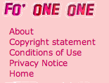
• Fo’ One One
This part of the web site has five parts. “About”, “Copyright Statement”, “Conditions of Use”, “Privacy Notice”, and “Home”. Perez Hilton’s style of writing this part is very casual. For example, in his “About” part of the website, he stated, “He is the Internet’s most devilish gossip columnist.” This shows that he isn’t as serious about this part of the website, as most of web authors are.
Interactivity in Perezhilton.com
Perez Hilton makes it very easy for the user to see the most important things that are happening in the celebrity world. People.com have a million different links and categories for types of entertainment that their users would like to see.

Share your thoughts